Create a Feminine, Eye Catching Social Media Feed With These 10 Photo Tips
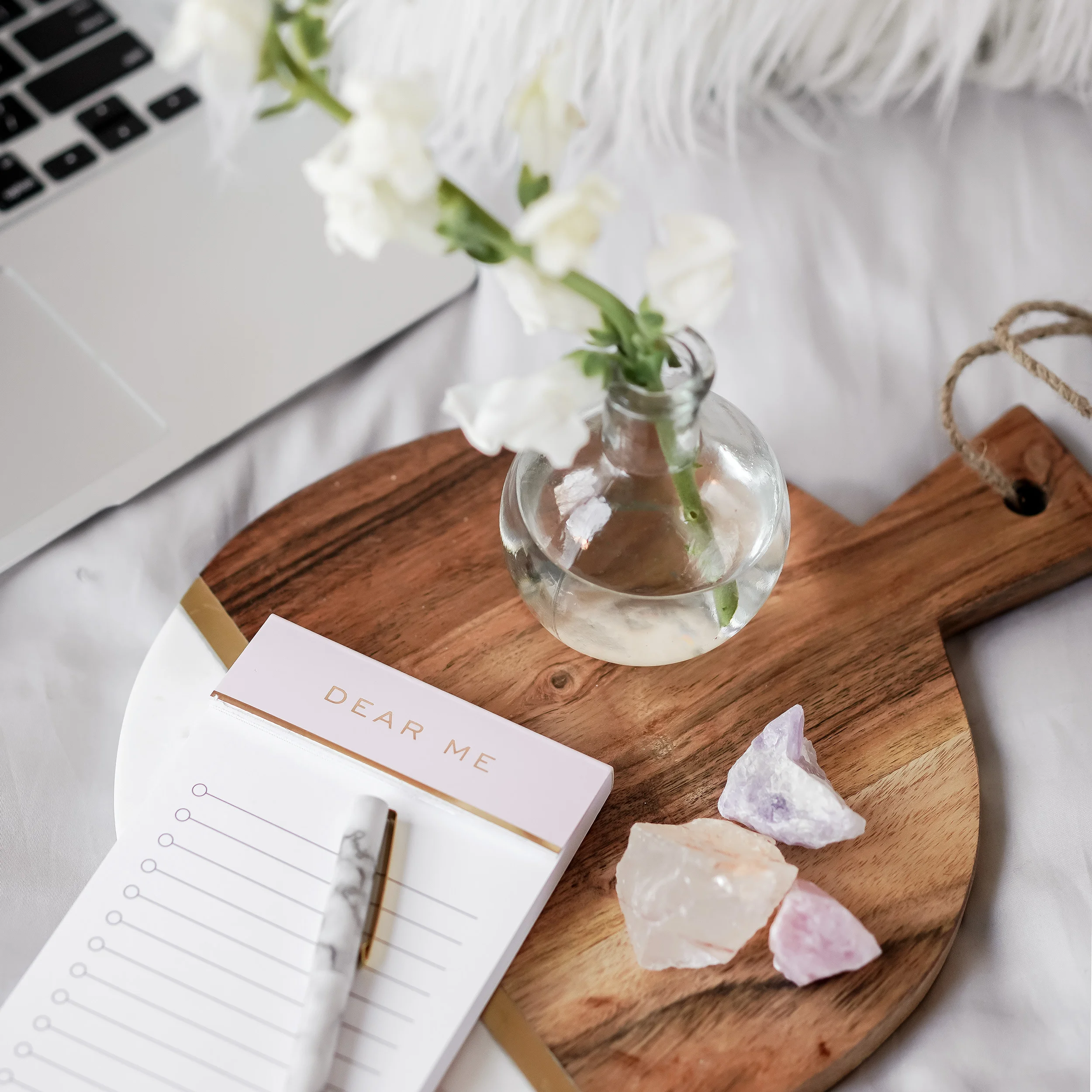
/Style is everything in this image saturated society we live in today. Your instagram, facebook, blog, and pinterest feeds need to showcase your style and brand in every post. Creating your own custom images can be a very rewarding and is a creative experience that I highly recommend taking your time to do on occasion--when time allows. However, when trying to keep up your long list of things to do as a business owner, getting your brand nailed in less time can be even more rewarding and saves you a lot of Brain Juice. Let's look at some ways to brand your blog, and cohesively build all of your social media feeds in a beautiful way that represents you, your brand and your overall image. First, we will look at designing our own, then at some free and low cost options for purchasing others.
This post may contain affiliate links, which means that at no extra cost to you, I make a small commission if you click on certain links and make a purchase. Other links are also included simply for your convenience.1. Start by creating the perfect, clean background. I typically prefer an all-white or neutral background when creating a flat-lay, branded image. Keep your background clean and fresh. An ideal surface to photograph your own images is a white science fair cardboard tri-fold. These cost less than $2, and provide you with all the space you need for your backdrop. Another great option, is to use Target's peel and stick wall paper in any of their varieties. I love this grey brick one they sell here. Make sure that wherever you take your image has a LOT of window light. Light is really more important than any backdrop you can find!
2. Remember imagery is EVERYTHING with these branded designs. Try and limit the amount of text on your graphic to 1-10 words. And it is critical to make sure your text is readable. Do not use images/backgrounds that are so busy you can't read the text, and make sure to use a bold, simple and contrasting font.
3. Less is always more in branded images. Bold fonts and busy/bright colors are not necessary. Every post on social media is begging for your attention. Limit the size of your font and the amount of words you use on your graphic to help audience quickly grasp your message.
4. Design Tools: I love Canva. It is all on-line, saves your templates and has a ton of pre-designed templates that you can work with. It is free unless you want to upgrade for a few more benefits. I use canva for almost all of my Pinterest graphics and basic design graphics. Creative Market, and Adobe InDesign are also excellent sources for design though they cost additional money.
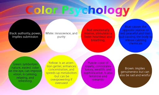
5. Color: Your color scheme throughout your social media and blog feed makes a bigger impact than you might think on whether or not your audience will engage with it. Researchers have found that 90% of snap judgments about products are made based on the colors. They say that colors tell a story and leave an impression. Red often conveys energy and urgency. Orange is seen as aggressive. Yellow represents optimism and youth. Green is associated with wealth and blue is connected to trust and security. Black can be powerful and blue is considered soothing. Consider the message your color scheme is sending and whether it represents your brand.
6. Balance. Human beings are naturally attracted to symmetry. Images that are cropped awkwardly initiate a subconscious discomfort. Try to create symmetry and balance in your images by not having too much going on in one section of the image and not enough in another.
7. Consistency. Instagram feeds should always try and be consistent with your brand's theme. A beautiful feed aesthetic really showcases your style. Try and keep your colors, balance, etc. consistent to whatever your theme is. Even if there is just a small pop of yellow in all of your images...find a way to create consistency.
8. Image Size and Editing Apps. I use PicTapGo and VSCO. Both mobile app editing options have a ton of great features for getting your image to its final, beautiful resting place. ;)
9. Stock Photography. One of my VERY favorite stock photography collections is from Styled Stock Society. There are literally hundreds of beautifully designed, stunningly feminine, easily usable images to download. Membership to the site is affordable and you get regular updates with new photo collections. This is my go-to stock photography site because I have so many options to choose from that perfectly fit my style. Sometimes the images even inspire my blog post topics! It really is that good!
10. Finally, be true to you. Don't overthink all of the rules. Experiment with bending the rules, see what works best for you. Avoid using stock photos that create an image that isn't YOU. This is your business, your brand. Be true to yourself and enjoy the process!


