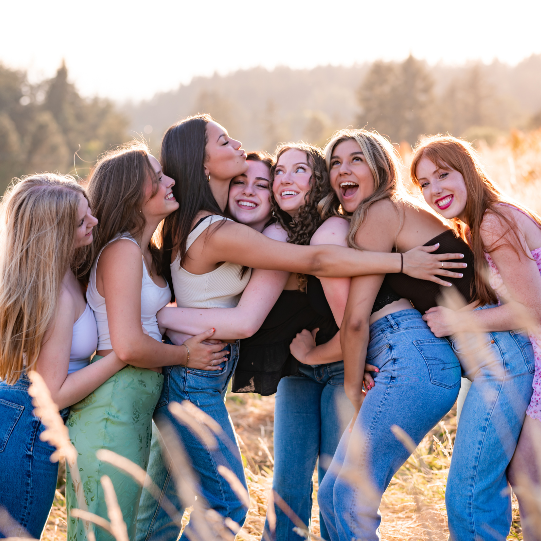
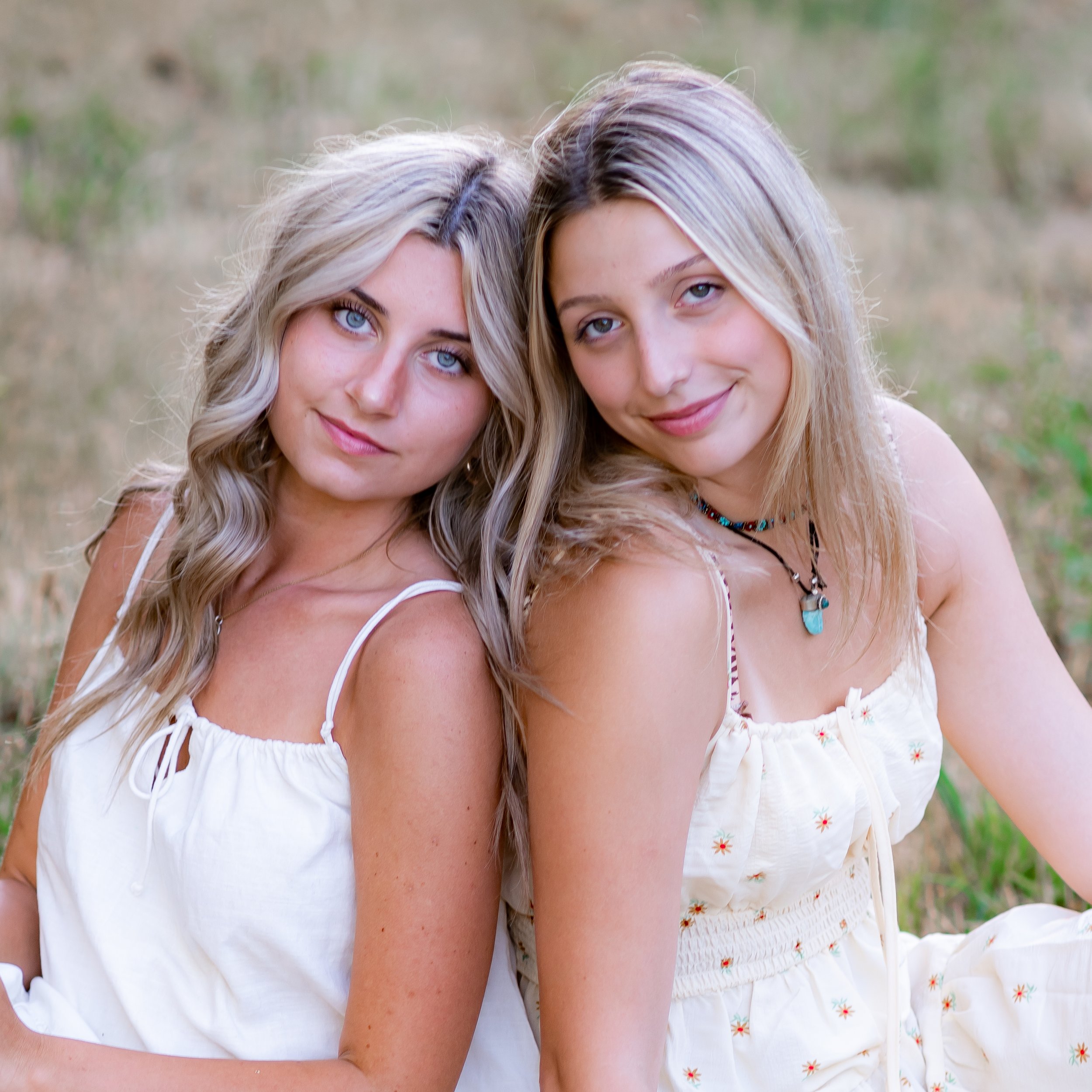
Lightroom Hack: Video Tutorial for Creamy Beautiful Skin Tones
/Step 1: Adjust white balance. One way of doing this is to use the dropper in the WB panel and find a neutral area in your image (whites of eyes, grey concrete, etc.) and click on that area to determine the appropriate white balance.
Step 2: Adjust the exposure. Higher exposure will brighten the skin, but use caution you don’t blow out the highlights in anyone’s skins.
Step 3: Adjust the contrast. To get that creamy look, it is usually best to lower the contrast a little. In this image I went —24.
Step 4: Adjust highlights and shadows. Since this image had a lot of white in it, I lowered the highlights all the way down to —100. I wouldn’t normally recommend going that extreme. I bumped the shadows up a little bit to further lighten skin without losing depth of image. I went to —26. I would never go higher than +35 on the Shadow slider. If you need it brighter than that, go ahead and adjust the exposure again.
Step 5: Whites and Blacks. I lowered the whites a little and bumped up the blacks a little to bring back some contrast without losing details and keeping the skin glowing.
Step 6: Clarity. This is one of my favorite skin hacks! This one slider can do magic for improving skin. If you lower it just the right amount, this will soften the skin without hurting the quality of the image. Lower the clarity a bit and you get an automatic edge taken off of all of the fine lines and wrinkles in the skin in one quick step. No need to airbrush everyone’s skin individually, this one little slider does it all for you!
Step 7: HSL/Color Panel. Make sure you are in the HSL option and Click Saturation. Adjust the yellow, and orange specifically for skin. The other colors only adjust as needed for your specific editing style. I went down to —16 in orange and went up +13 in yellow. Then click on the luminance to get the new menu. I add a little red, orange, and yellow (red was +9, orange +7, yellow +16). Play around with the other colors as it fits your editing style.
What does HSL stand for?
H - Hue
S - Saturation
L - Luminance
The Hue Slider shifts the actual color. For example, if you wanted the water in an ocean picture to be more teal or green you would adjust the blue and green on the hue slider.
The Saturation Slider fades or deepens the individual color. To see how effective this slider is, go ALL the way to 100 or -100 and see how it is affecting your image.
The Luminance Slider is a very subtle, but powerful slider. It works with the brightness of the specific color. Play with this slider and be cautious as a little can go a long way!
Step 8: Split Tone Panel. Highlights: Hue 51; Saturation 4. Shadows: Hue 206, Saturation 4. This is a super subtle difference, though if you aren’t careful this can get out of hand. This is my general rule of thumb numbers for the Split Tone Panel.
Step 9: Detail Panel Adjustments. Go to Luminance and increase the luminance ( (to about 30) with detail at 50. The default settings on color/detail/smoothness can be adjusted to taste as well.
Step 10: The skin should now be really creamy and virtually flawless, however if you need to fine tune here with the spot removal brush, etc. now is the time!
Once you have it exactly how you want it, you can then copy and paste your settings for all of the images in that series and you are done editing!
For my tips on changing a distracting background in photoshop, click here and here.


